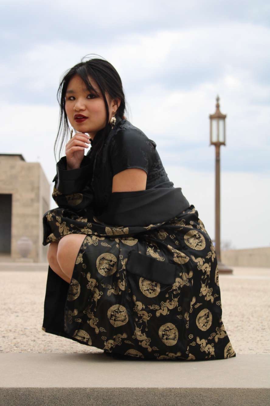
1989 (Taylor’s Version) Inspired Photoshoot
- Evan Neubauer

- Jan 15, 2024
- 4 min read
Updated: Jan 24, 2024
You may be surprised to find that within my circle of fellow Christians, I am accepted and loved as a queer woman of color. It is a common (although valid) misconception that all Christians hate all gay people, when in fact, my spiritual peers reject me for another more obvious yet infinitely more harmful part of my identity: I am a Swifty, specifically one from Kansas City.
In celebration of the current Snow on the Beach, I’ve been reminiscing on a photoshoot inspired by our lord and savior Taylor Swift’s Polaroid-themed album titled 1989. Whether or not you’re a Swifty, however, planning and photographing themed shoots is awesome practice for photographers and visual artists. My credentials? Take a look.

There are generally three steps to turning an artistic vision into a cohesive photo: planning, shooting, and editing. Following these steps helps you get an idea of what specific elements you want in your photo. For me, it’s really important that my photoshoots are inspired. I don’t want to make another 1989 album cover, rather capture the essence of the music and era. To start, I need to do a little research.
Wildest Dreams: Planning
Swift’s photographer for her recent albums, including Midnights, Folklore, and several of her rerecordings, is Beth Garrabrant. In addition to Taylor Swift, Gallabrant has worked with names including Disney on their 2021 live-action Cruella and The Wall Street Journal. Gallabrant studied photography at both the University of Notre Dame and the International Center of Photography. Her work uses characteristics of both narrative and documentary, creating striking images that explore the minute details in larger themes.
Looking at Gallabrant’s images from the 1989 (Taylor’s Version) shoot, I found myself drawn to the low-contrast colors and simplicity of composition. In the images below, Gallabrant blends her colors into a bold focal point, the blue sky for example. That flatness gives a distinct film feel to the photos.

Once I nailed down the elements I liked best from the album photos, I then started pulling out some keywords that I could search Pinterest with for more inspiration:
Vintage
Summer
Beach
Polaroid
1989
Fashion
From there, I just pinned together a little moodboard on Pinterest for the shoot. Once I compiled a handful of images that with a similar aesthetic to my vision, I looked for common elements and came up with a color palette. I ended up choosing very cool-toned colors with just one or two bolder hues, of course including the signature 1989 blue!

For me, the three most important elements for the shoot became the beachy background, simple composition, and low-contrast editing. With these three pillars, we’re ready to start shooting!
How You Get the Girl (to look how you want): Shooting
Art demands effort, so for this shoot I actually ended up getting into the water with my model. Unfortunately, the geography of Winona, Minnesota lies just outside of the Twin Cities and supplies no ocean beaches. Instead, we chose a relatively calm spot on the Mississippi River to work.
To keep my composition really clean and simple, I put my model on backgrounds with a good amount of color but without a ton of different trees, boats, etc. going on. I avoided spots that had contrasting or warmer colors, and directed my model to frolic about in order to get a really free and candid energy.
Never Go Out Of Style: Editing
The raw photos came out a little rough, so a lot of the magic actually happens in post. When I edit, I always always start with light. I wanted a really even exposure across the whole photo to give it that kind of flat, vintage look. Too much contrast looks really modern and digital, so after I flattened my light, I added a little grain to the photos. Personally, I don’t want to take this effect too far because I still want to preserve my own style in the photo, but if you’re looking for a more in-depth look at the film style, I recommend a post by Moment.
 |  |
Raw | Edit |
After flattening my exposure, I turn down the tint of my photo to make it a little more cool-toned. I tend to like higher-contrast photos, so to blend my style with the lower-contrast photos I was inspired by, I chose to juxtapose the black with the pastel blues and cream colors. This helped me keep my hues similar enough to blend together nicely, while still giving a strong focal point.
And here’s how they turned out! As a photographer who primarily specializes in sports photography and senior portraits, shoots like this are so much fun for me to get creative with and explore some new styles. I hope this little walk through my photographer brain helped you with your next photoshoots! The full moodboard I used for this shoot and many others is up on Pinterest if you’re looking for more inspiration and some awesome other creators. To see more of the results, check out my Instagram, Pinterest, and Portfolio!


Comments